


If you’ve ever opened your Notion calendar and felt that everything looks a bit too… same, you’re not imagining it. Notion’s default calendar colors are limited, and at first glance, it feels like you’re stuck with them. But the truth is, Notion gives you more flexibility than it openly advertises. You just have to know where to look and how to structure your data.
This guide is written for real users who actually use Notion to plan work, life, or both. No hacks that break tomorrow. No fluff. Just practical ways to add more visual variety and clarity to your Notion calendar so it actually helps you think better, not harder.
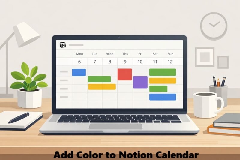
Why Notion Calendar Colors Feel Limited
Out of the box, Notion calendar views don’t let you manually paint each event with a custom color like Google Calendar does. This isn’t a bug. It’s a design choice. Notion calendars are database-driven, which means colors are tied to properties, not individual dates.
Once you understand this, everything clicks. More colors don’t come from the calendar itself. They come from how you design the database behind it.
The Core Concept: Colors Come From Properties
In Notion, calendar colors are controlled by properties such as Select, Multi-select, Status, or even Relation-based logic. Each option inside these properties has its own color, and those colors are what appear in your calendar.
So if you want more colors, the solution is simple in theory: create smarter properties with more color options. In practice, it takes a bit of planning.
Using Select Properties to Unlock More Colors
The most reliable way to add more colors is by using a Select property. For example, instead of a generic “Event” title, create a Select property called something like “Category” or “Type.”
Inside that property, you can add multiple options such as Work, Personal, Health, Learning, Travel, Deadlines, or anything that fits your life or workflow. Each option can be assigned a different color. Once this property exists, you can tell your calendar view to color events based on it.
Suddenly, your calendar stops being a wall of identical blocks and starts telling a story at a glance.
Multi-Select for Layered Color Meaning
If your life or work isn’t neatly divided into one category per event, Multi-select properties give you more flexibility. For example, a single event could be both “Client Work” and “Urgent,” or “Personal” and “Health.”
While the calendar will usually prioritize one visible color, multi-select tags still add clarity when you open an event. This approach works especially well if you use your calendar for planning rather than strict time-blocking.
Status Properties for Visual Priority
Status properties are underrated when it comes to calendar color control. Instead of thinking in categories, think in states. Planned, In Progress, Done, Blocked, or Cancelled are common examples.
When your calendar is colored by status, it becomes a visual dashboard of momentum. You can instantly see what’s moving forward, what’s stuck, and what’s already handled. This is incredibly useful for project-based schedules or editorial calendars.
If you are managing complex projects or teams, understanding how to use Notion for business can help you design status workflows that scale beyond just simple colors.
Filtered Views = Even More Color Control
Here’s a trick many users miss. You can create multiple calendar views from the same database, each filtered by different conditions.
For example, one calendar view might show only Work-related items colored by category. Another view might show Personal events colored by status. Same data, different visual logic.
This doesn’t technically add new colors, but it dramatically increases how many colors you see and how meaningful they are in context.
Emojis and Icons as “Extra Colors”
Notion doesn’t limit you to color alone. Emojis and page icons act like an additional visual layer. A red circle emoji, a blue book, or a green checkmark can communicate meaning faster than color alone, especially when colors start repeating.
Used sparingly, icons combined with colored properties make your calendar feel richer without becoming chaotic.
Common Mistakes That Make Calendars Ugly Fast
The biggest mistake people make is adding too many colors without a system. If two colors mean almost the same thing, your brain won’t remember the difference. Another common error is changing color meanings over time. Once red means “urgent,” it should always mean urgent.
Consistency matters more than creativity here. A boring but consistent calendar is far more useful than a colorful mess.
What Notion Still Can’t Do (And That’s Okay)
It’s important to be honest. Notion still doesn’t allow fully custom hex colors or manual per-event coloring in calendars. If you need pixel-perfect color control, Notion may not replace traditional calendar apps for you.
Some advanced customization features might depend on your plan, so it’s worth reviewing Notion pricing before trying to build an overly complex system.
But for planning, prioritization, and long-term visibility, its property-based color system is actually more powerful once you lean into it.
Final Thoughts
Adding more colors to your Notion calendar isn’t about hacking the app. It’s about designing better data. When your properties are intentional, your calendar becomes easier to read, faster to understand, and more enjoyable to use.
If you treat your Notion calendar like a living system instead of a static schedule, the colors will naturally fall into place—and you’ll wonder how you ever worked without them.